
I’ve always been fascinated by empty space. You wouldn’t necessarily guess that from looking at my paintings, where there isn’t much of it. But in design, space is something I have to pay close attention to. And sometimes, the questions that come up in one part of my practice lead me somewhere unexpected in another.
A Sketchbook Full of Leaves
For a while, I devoted an entire sketchbook to exploring composition. I wanted to work within a single visual world, and botanical forms have always held a particular appeal for me. So I set myself a simple challenge: to create compositions using nothing but leaves.
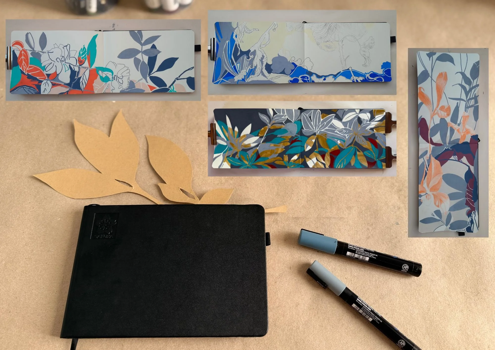
I filled this sketchbook over the course of eight months. During that time, I explored a different design question with each composition. As the months went by, I became faster and more confident in developing and executing my ideas.
I narrowed the possibilities further by setting color aside as much as possible. Working with acrylic markers meant I could skip mixing paint and use predetermined hues instead. With a limited palette, I could focus on what interested me most: finding shapes, exploring the role of line, and figuring out how the individual elements might work together.
The result was nearly twenty-five compositions made from leaves gathered in my own garden.
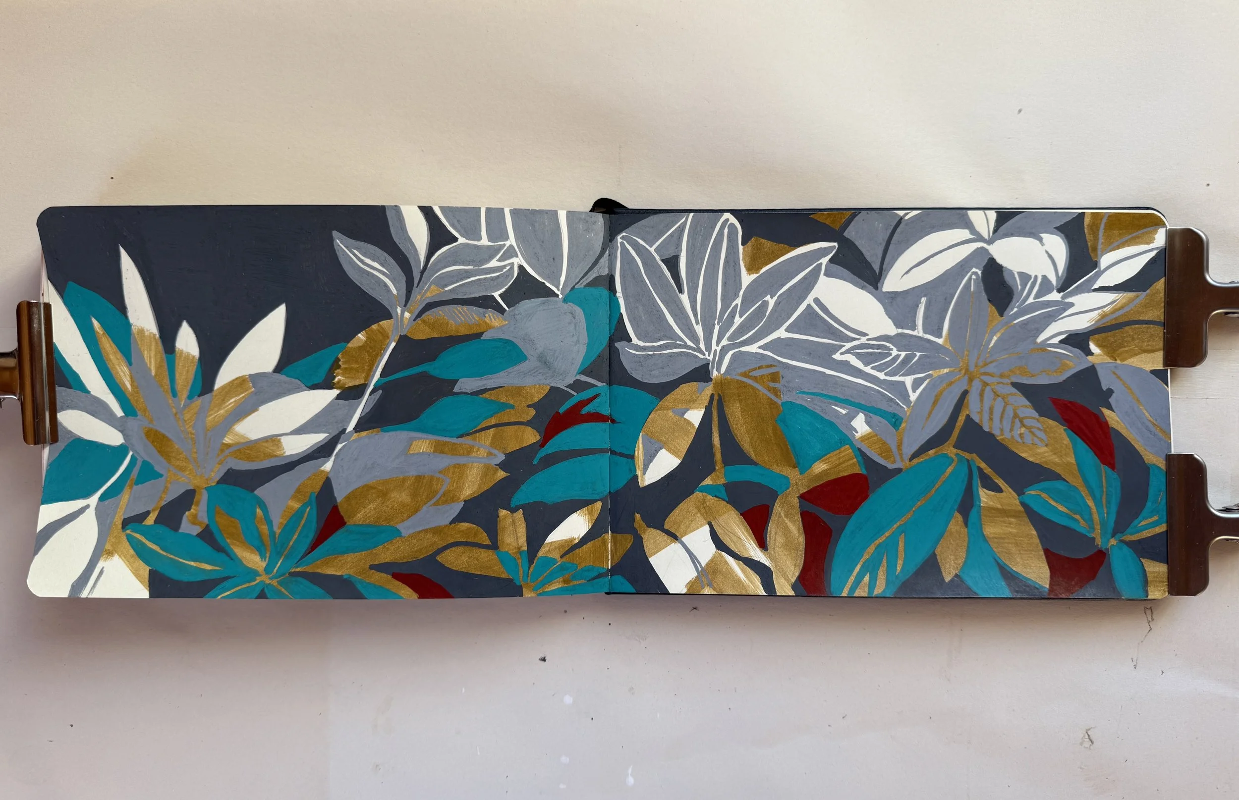
On this double-page spread, empty space occupies relatively little area, yet it plays a crucial role in balancing the colorful, highly rhythmic composition.
What I enjoyed about this exercise was the freedom that came from its limitations. With fewer decisions to make about color, I could spend more time looking at the relationships between shapes. A leaf could be moved, turned, or removed entirely, and suddenly the whole composition would feel different.
Often, the most interesting changes happened in the spaces between the leaves.
Looking at What Isn't There
When working with shapes and lines, it's almost impossible not to notice the space around them. In design, this is often called negative space or white space. The terms overlap, although I find it useful to think about them a little differently.
Another goal for this sketchbook project was to encourage experimentation within the constraints I had set myself. Here, I used carbon paper to transfer a drawing, deliberately introducing a counterpoint to the colorful marker strokes.
Negative space draws attention to the shapes formed by the areas around, between, and sometimes within the elements of a composition. These spaces aren't simply what's left over.
They help define the forms themselves and influence how we perceive their relationships.
Empty space makes me think about something slightly different: the feeling of openness in a composition. And I've come to realize that an area doesn't have to be white, untouched, or completely free of texture to feel empty. It depends on what surrounds it and how it relates to everything else.
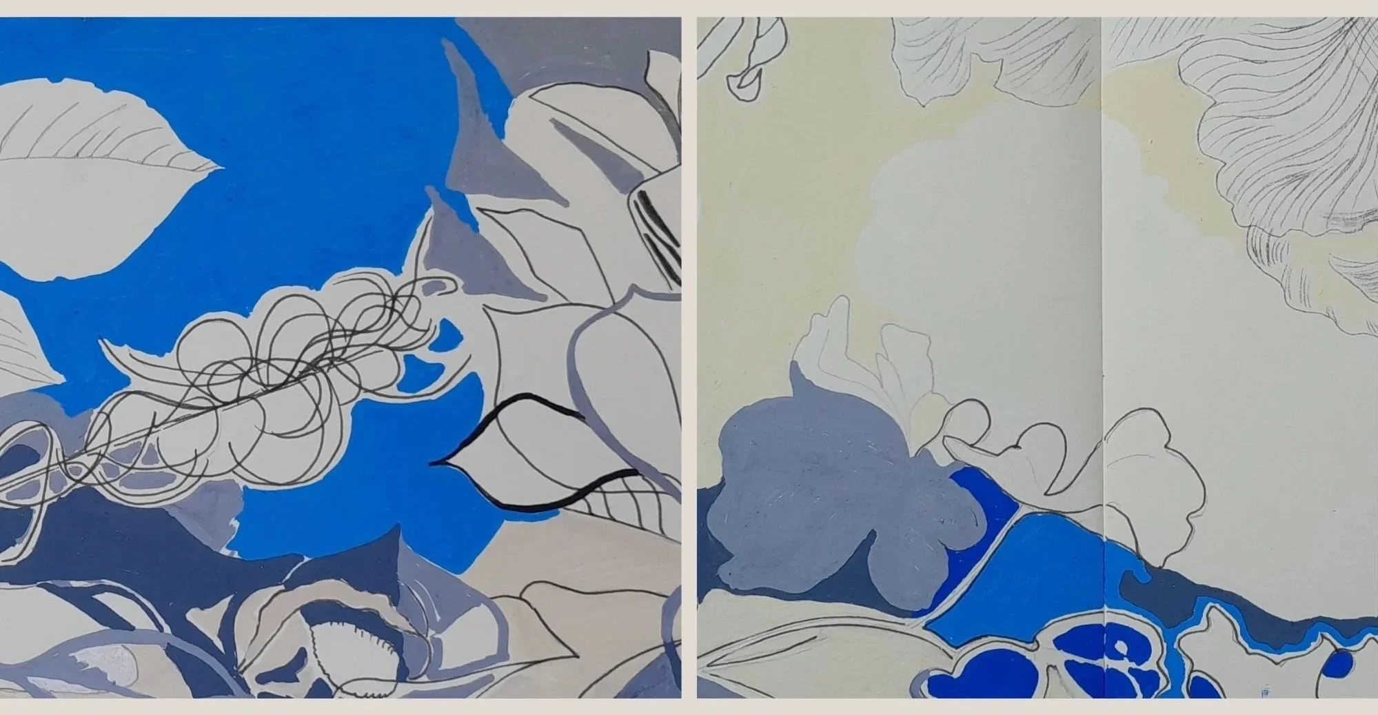
Left: Whitespace, this time in blue, with an emphasis on small areas of negative space to create rhythm.
Right: Although the whitespace is rendered in two colors, it still reads as one continuous, open space.
A quiet area can give the eye somewhere to rest. It can allow a shape to stand out or keep a composition from feeling crowded. But it can also create tension. Sometimes a small shift in the arrangement makes a space feel generous; at other times, the same space seems awkward or constrained.
These are subtle differences, but they can change the entire impression of a piece.
Making Room for Possibilities
I've been thinking about how much of this applies to painting, too. In art, the space that remains unpainted can take on a life of its own. It doesn't necessarily have to describe anything or serve a practical purpose. Sometimes, what isn't depicted becomes just as compelling as what is.
I find this particularly interesting when looking at the restrained paintings of Agnes Martin, where even the slightest variations seem to matter, or in traditional Chinese landscape painting, where empty space creates tension within the composition and shapes the relationship between the painted elements.
These are very different approaches, of course. But both remind me that a painting doesn't have to fill every available space to feel complete.
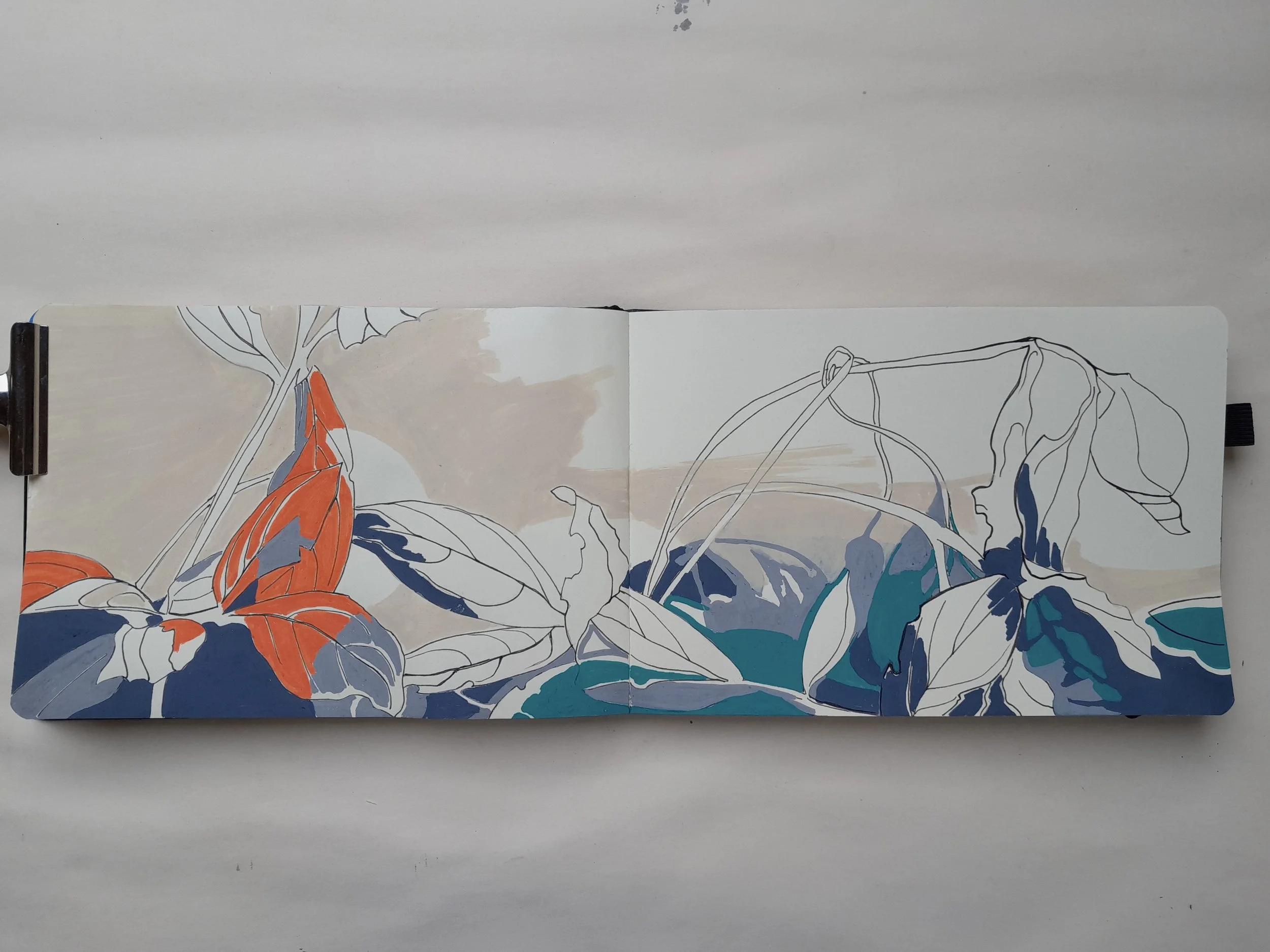
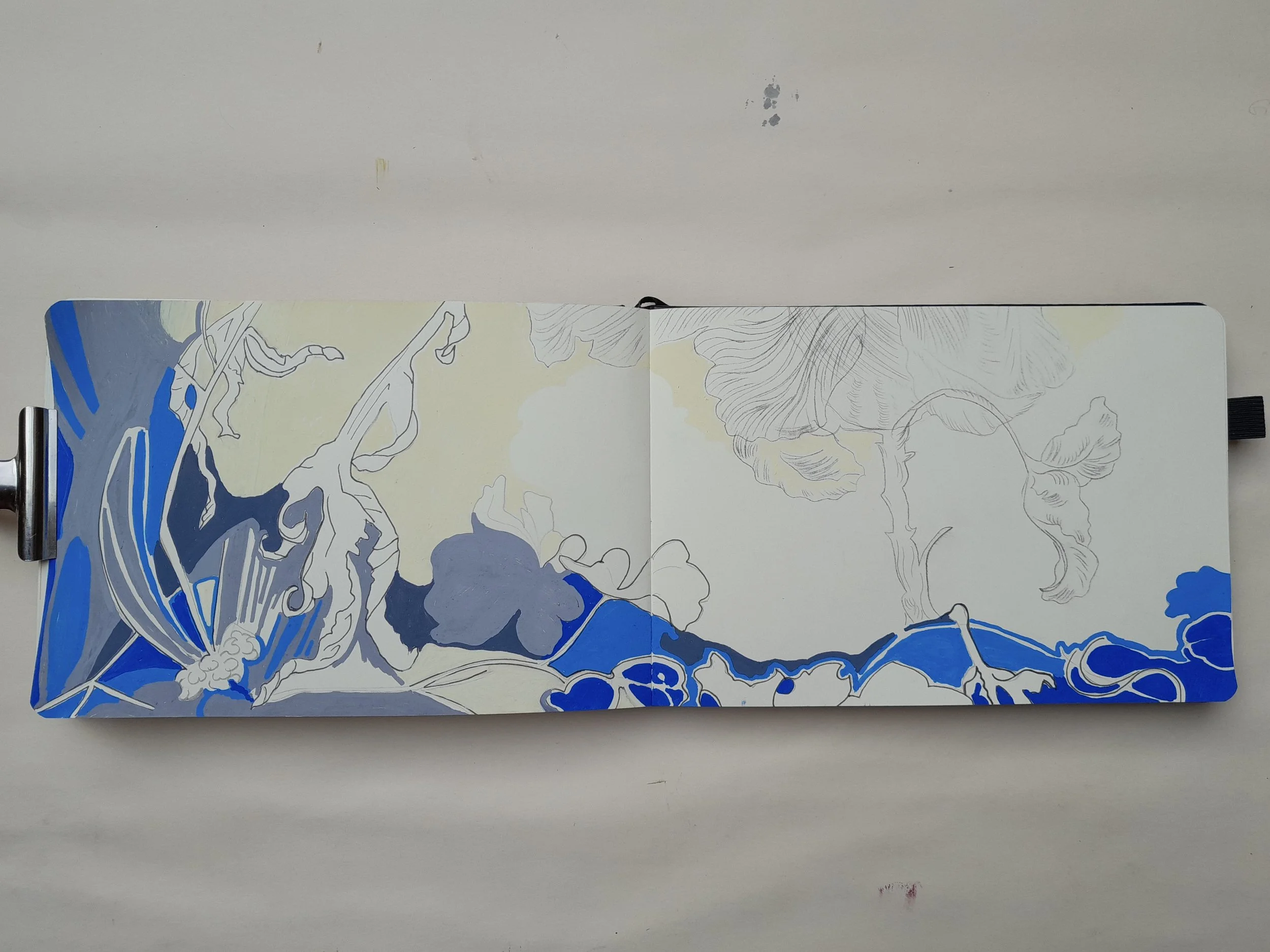
In this piece, I left the negative space — think of it as the sky above the leaves scattered on the ground — divided into two sections. The marker strokes add texture without filling the emptiness of the space. At the same time, two areas of negative space form abstracted leaf silhouettes that echo the positive leaf shapes in the composition.
My own work doesn't always leave much room for emptiness. Perhaps that's part of the reason I'm drawn to exploring it in my sketchbook. Working with leaves gave me a way to slow down and pay attention to something I might otherwise overlook.
Looking back at those pages, I'm reminded that composition isn't only about deciding what to put into a picture. It's also about noticing what happens around it.
A Few Things I've Taken Away From This Exercise:
Limiting my palette helped me focus on shape and composition.
Looking at the spaces between forms revealed possibilities I might have missed by concentrating only on the leaves.
Leaving a space open doesn't mean it has to be white or untouched. Its effect depends on the elements around it.
A composition’s negative space can create tension just as much as it can bring a sense of calm.
I'm not sure this has made my paintings any less crowded. But it has changed the way I look at the space around the things I paint—and sometimes, that's where a new idea begins.
Take a Closer Look
If you'd like to see more of this process, I've documented all the compositions from this sketchbook here on my website.
You can also find a short Instagram Reel where I share the process of creating one of the sketchbook designs.