
In Conversation with Color
A challenge of Color
Violet was the color I didn't know how to use, and that was exactly why I needed to spend time with it.
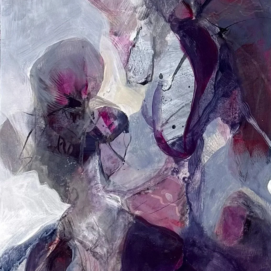
Detail from Untitled; Acrylics, mixed media on paper, 2026
Color is never quite as simple as it seems. The moment two hues meet on a surface, something begins to happen between them. They alter one another, shift in intensity, and change the atmosphere around them. This is where painting becomes interesting to me.
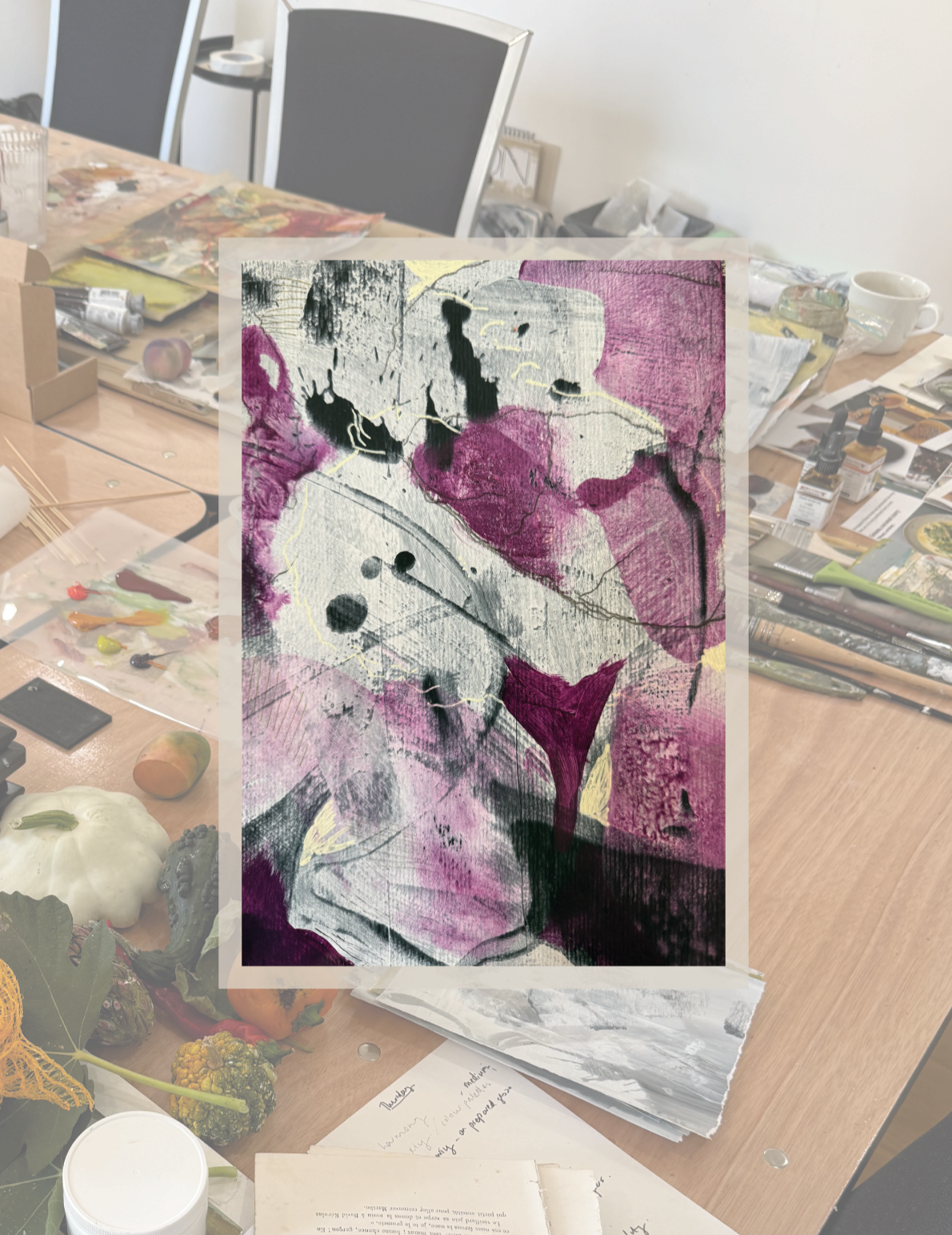
During a recent workshop, I found myself working with a color I would normally never choose as a starting point or the star in a painting: violet. It felt unfamiliar, almost as if it belonged to someone else’s palette. Rather than trying to work around it, I decided to stay with it and figure out how to make it feel at home within a composition.
I had to spend time with the color, observe how it responded to other hues, and gradually discover what it needed in order to become part of the painting.
Questions for Color
Color has become the central thread running through my practice, but understanding it has been a slow and very hands-on process.
The catalyst for this particular exploration was the realization during the workshop that I never actually use violet as a starting color in my paintings. Instead, I use it to create accents or to mix neutral tones. But this time, a shade of a reddish violet was the baseline. To me, this color feels very energetic, and I almost always feel the need to tone it down.
During the workshop, I found myself having to step directly into the composition and work with a violet hue before I had really figured out what I wanted to do with it. There was no time to analyze it beforehand. I had to paint, respond, and find my way into a color harmony as the work developed. I had to discover, almost through the act of painting itself, what could make violet feel at home within the composition.
A Quiet Laboratory
It was only afterward, back in my studio, that I began to explore what had happened more deliberately.
I turned to my sketchbook and started making color studies, finding different shades of violet, placing violet alongside different hues and testing the relationships between them. I wanted to understand why certain combinations worked, why others felt awkward, and what happened when I changed the balance, temperature, or intensity of the colors around it.
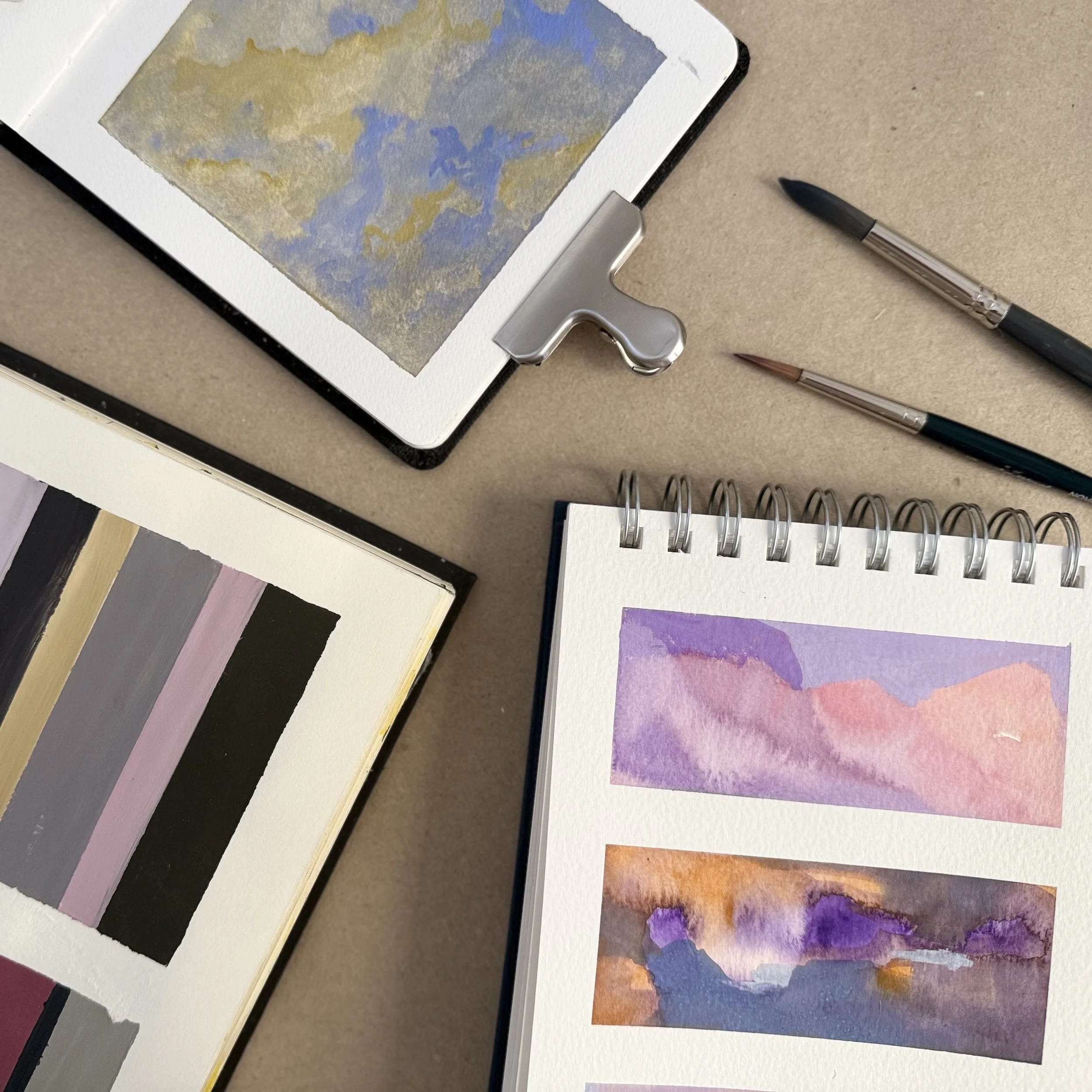
Color studies from several of my sketchbooks.
What had initially felt unfamiliar gradually became more nuanced. I began to see when violet could be quiet or intense, soft or powerful, depending on its saturation and on what surrounded it. The process was less about controlling the color and more about discovering its possibilities.
Much of this exploration takes place away from the canvas. My sketchbooks have become places for looking closely, testing possibilities, and allowing myself to be uncertain. I make small color studies, sometimes very deliberate, sometimes almost intuitive. I place hues next to one another, alter their proportions, introduce unexpected combinations, and observe how their relationships change.
There is no pressure for these studies to become paintings.
That freedom is important. It allows me to concentrate on what color is actually doing — how it behaves, how it alters space, how it can create balance or tension, softness or depth.
Nothing Exists Alone
This experience brought me back to what I find so fascinating about painting: color is never fixed.
A hue does not exist independently. Its character changes according to what surrounds it.
Violet hues range from red-violet to blue-violet. I therefore made my color studies using Windsor Violet and Lavender. Windsor Violet has a red bias, while Lavender has a blue bias.
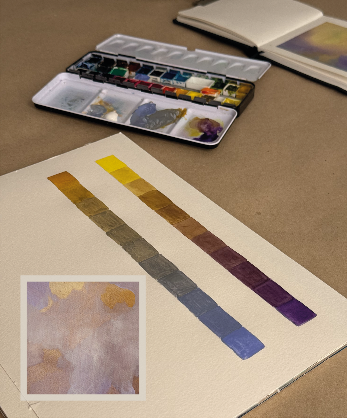
Color Studies with Hansa Yellow & Winsor Violet, Yellow Ochre & Lavender
I used two different yellows, Yellow Ochre and Hansa Yellow, to mix neutrals. This resulted in different kinds of neutrals: some tending towards brown, while others appeared more blue-grey.
Placing neutrals alongside strong, saturated colors is the key to balancing the color composition. This experience also reminded me that some of the most interesting color relationships cannot be fully understood in advance.
Sometimes you have to surrender to the process of painting without questioning it, and only reflect on it afterwards.
A Dialogue Emerges
At the studio, I also had the opportunity to look through the photographs of my paintings that I had taken during the workshop. This allowed me to retrace the creative process and compare the different stages of a painting.
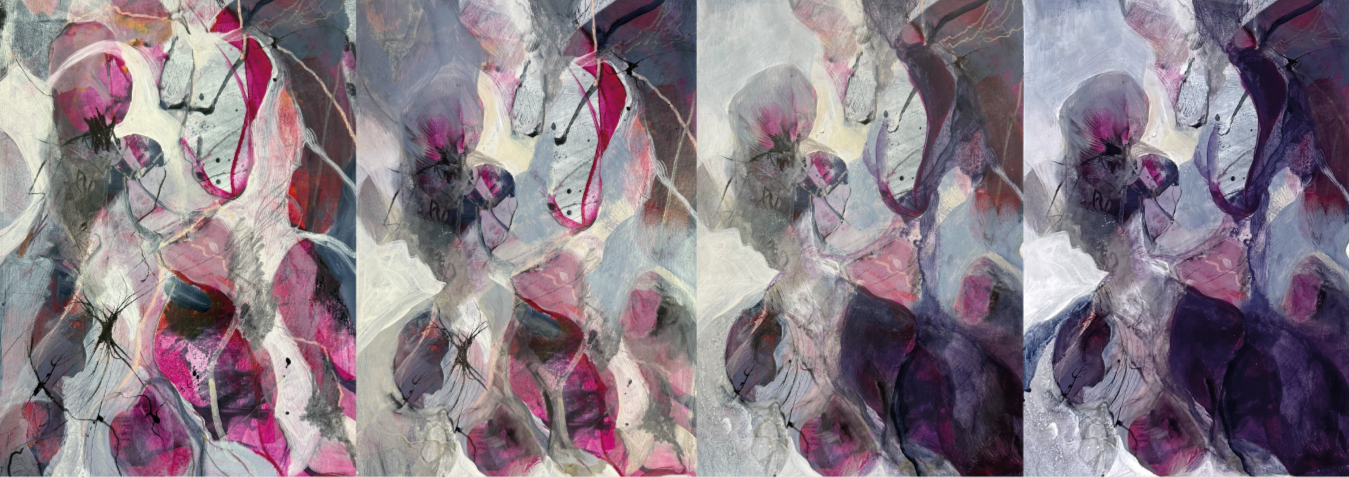
Different stages of the process of Untitled; Acrylics, mixed media on paper, 2026
I noticed that I am drawn to the way transparent layers of paint interact, creating subtle shifts in color as one hue passes through another. A new layer does not simply cover what is underneath; it changes it, creating nuances that could not have been mixed directly on the palette. The surface remembers.
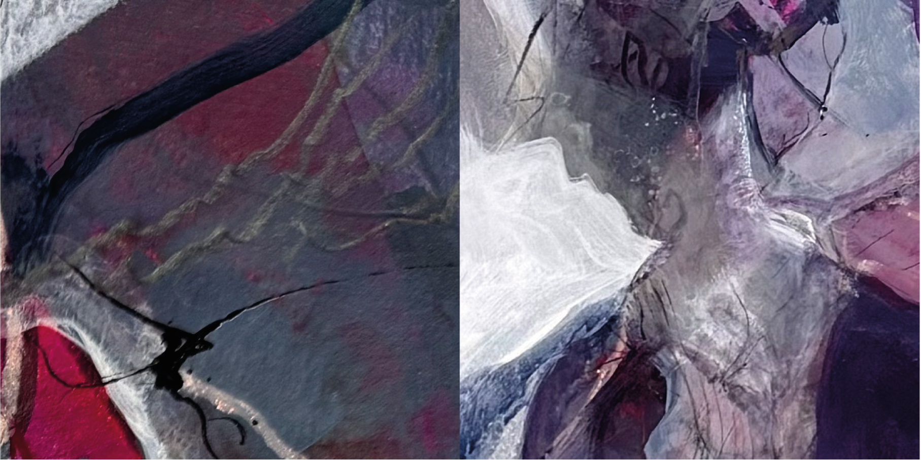
Details from different stages of the process.
The insights gained from comparing the process photographs provided wonderful complements to the exercises in the sketchbooks.
This is why the paintings feel connected to the sketchbooks, even though they serve very different purposes.
The sketchbook is a space for questions. The painting is a space where some of those questions become tangible.
Making Friends with Color
Perhaps the easiest way to approach a color one doesn't usually use is not to ask whether one likes it, but to give it some time.
Make small, loose studies. A sketchbook is a good place to collect information without expecting anything to work.
Take your time to experiment and play. Change the proportion of the hue in the composition. Put the color on the page without trying to make a finished composition.
Incorporate colors you know well. Place it next to familiar colors and notice how the relationships change.
Create variation in lightness and color temperature. Try it lighter, darker, warmer, cooler.
Play with the proportion of space it occupies within the overall composition. Give it more space, then less.
Change the surrounding colors rather than the hue itself. If it feels too strong or unfamiliar, experiment with its surroundings before removing it.
Document your working process. Photographs of different stages of a painting enable further reflection and a deeper understanding.
What I learned from working with violet is that a color needs time to reveal itself. It doesn't have to be loved before it can become useful. Sometimes it simply needs to become familiar.
And sometimes the colors that make us hesitate are the ones that can take a painting somewhere new.
It is a way of working I keep coming back to: try something new, stay curious, and see what happens.
Find out more about the workshop in my journal entry, “A Creative Growth”, and follow along on Instagram to discover more about my process.