
A Color Palette Evolves
The Language of Color
In my last journal entry, I wrote about the challenges of working with a color that was unfamiliar to me and not usually part of my palette. Today, I want to share how I develop color palettes for my paintings.
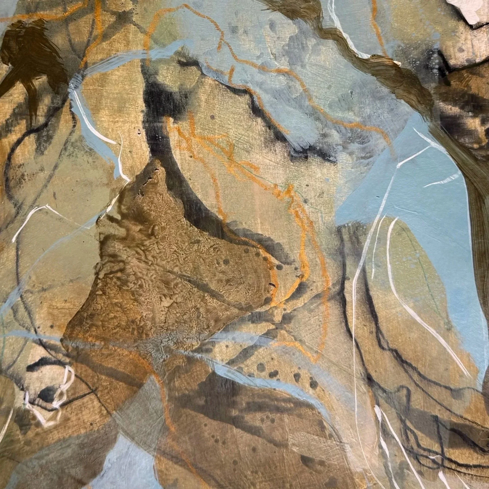
Detail Untitled; Acrylics, Mixed Media on Paper; 2026
For me, the power of color lies not so much in a single hue as in the relationships and harmonies between several colors. I think of a palette as a kind of chord made up of at least three colors, with one hue taking the lead and giving the composition a clear focal point.
Over the past two years, I’ve been drawn to botanical themes and motifs. My palettes naturally evolved from this interest, favoring muted hues and earthy, organic tones.
An Unexpected Palette
During a recent trip to France, I discovered charming small towns and villages filled with colorful markets, fresh flowers, local foods, and handcrafted goods. But what captivated me just as much were the shops, with their beautifully curated displays and imaginative interiors.
The window displays were incredibly creative, and the merchandise was arranged with such care and abundance. Some shops and cafés felt both sophisticated and effortlessly relaxed. Every color and decorative detail seemed thoughtfully coordinated with the products on display.
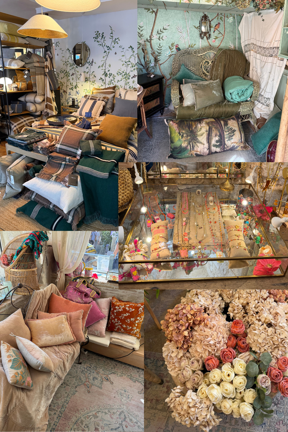
Inspiration from various boutiques in France
These weren’t simply places to shop; they were immersive worlds. Through furniture, display cabinets, wallpaper, textiles, and floral arrangements, the owners had created unique experiences for all the senses. Even the fitting rooms in some clothing boutiques were so inviting that you hardly wanted to leave.
I was especially drawn to the interplay of textiles, plants, and carefully balanced color harmonies.
In a boutique specializing in women’s clothing made from fine natural fabrics, jewelry, and accessories, I discovered a color arrangement that literally took my breath away.
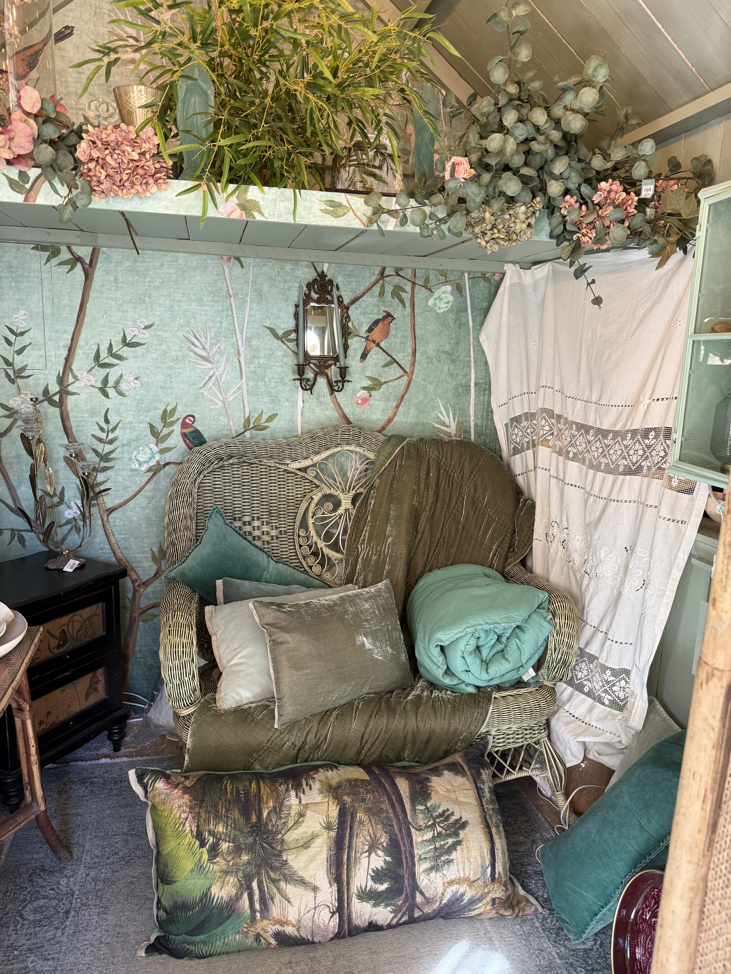
The Art of Color Relationships
Soft turquoise was the dominant hue. Turquoise can be bold, cool, and intense, but here it was surrounded by olive and sage greens, creamy white, and blush pink. Every color had a soft, sandy quality, as though a golden shimmer rested over the entire arrangement.
Back in my studio, I knew I wanted to create a painting inspired by this palette.
I chose an ochre tone for the underpainting, planning to build the turquoise on top of it in several layers. Through glazing and carefully mixed colors, I wanted to create a warm, golden undertone that would soften the turquoise without losing its freshness.
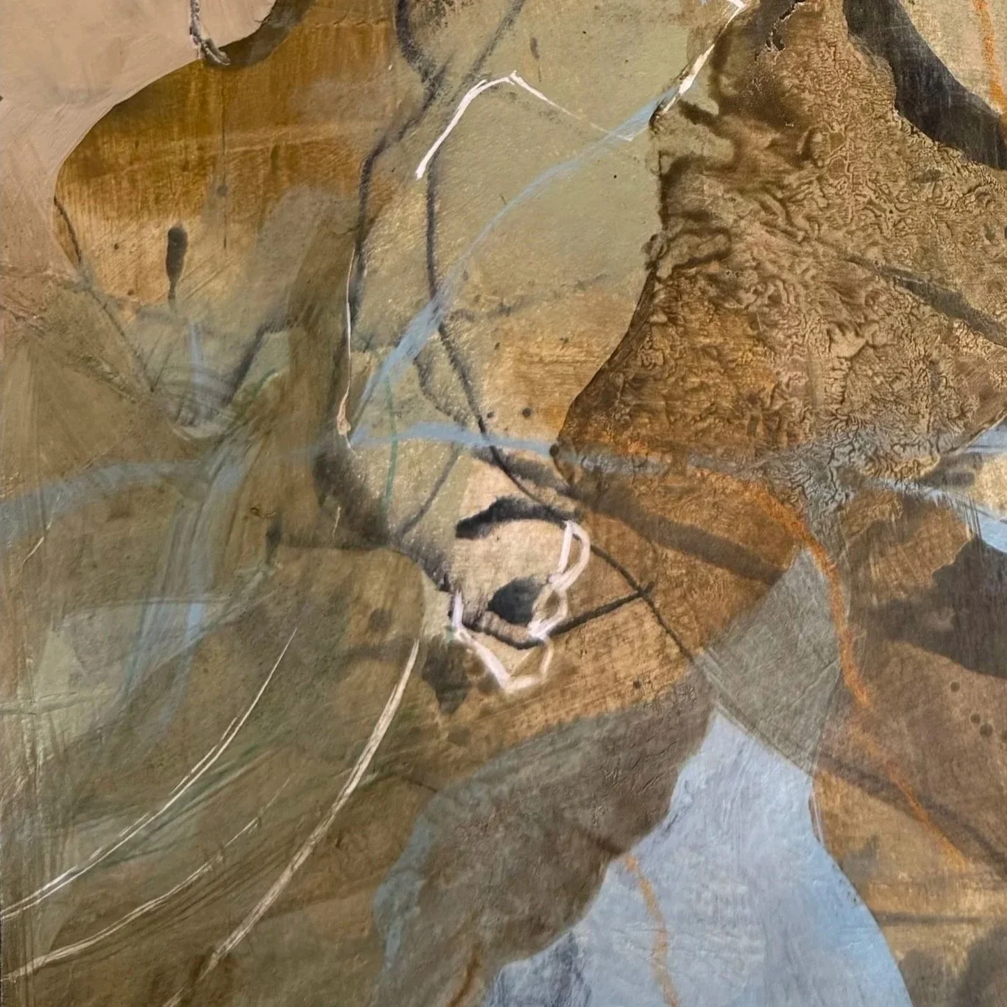
Detail Untitled; Acrylics, Mixed Media on Paper; 2026
What fascinated me most was the interplay between warm and cool colors. Under what conditions does a cool turquoise begin to feel warm? When does it bring a refreshing coolness to a painting? How do colors interact when placed side by side, and how does their relationship change when one is layered over another?
And what other hues does the composition need—perhaps a subtle supporting color or an unexpected accent that adds a little tension?
These were the questions I explored as the painting took shape.
A Palette Comes to Life
Surprisingly, the composition came together quite quickly. The colors found their balance, and the painting began to express the atmosphere I had experienced in the boutique.
Translating that fleeting impression into my own visual language was deeply satisfying. I wasn’t trying to reproduce the original arrangement exactly. Instead, I wanted to capture its mood, its warmth, and the subtle tension between cool turquoise and earthy, golden tones.
One Palette, Endless Discoveries
Once the painting was finished, I realized that this was only one of countless possible variations on the same color harmony.
The same hues can be explored again and again, revealing new relationships and unexpected possibilities each time. A slight shift in temperature, a different proportion, or an additional accent can change the entire character of a composition. For me, this is one of the most fascinating aspects of working with color: there is never just one right answer.
A palette is not a fixed formula but an ongoing invitation to experiment, discover, and see familiar colors in a new light.
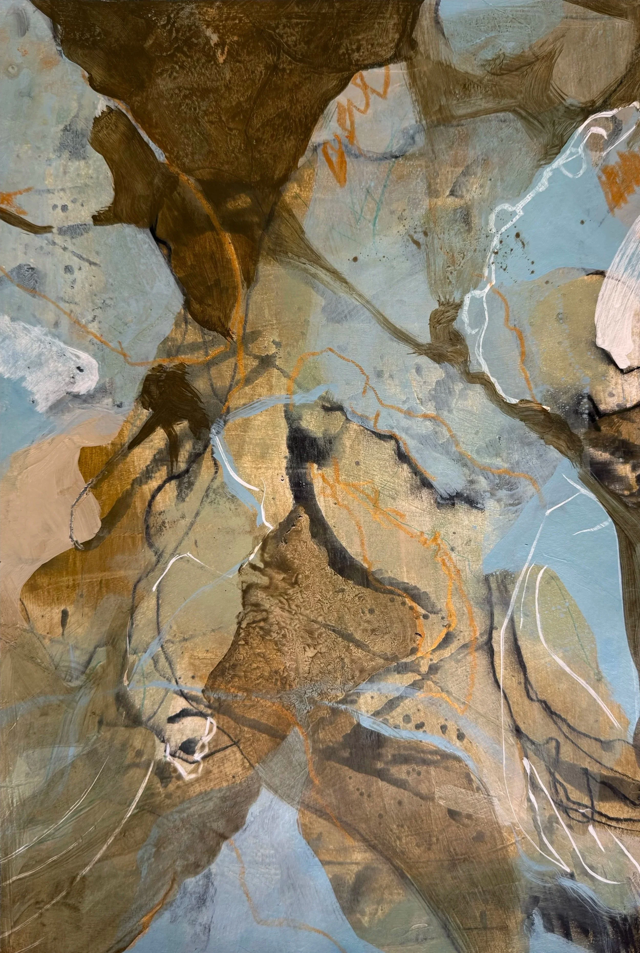
Untitled; Acrylics, Mixed Media on Paper; 2026
A Few Thoughts on Color
Color is all about relationships. A hue reveals its true character through the colors around it, creating harmonies and contrasts that would not exist in isolation.
Every palette needs a sense of direction. A dominant hue gives the composition its identity, while the supporting colors add depth, nuance, and balance.
Warmth and coolness are relative. The temperature of a color can shift depending on the hues beside it or the layers beneath it, opening up subtle and unexpected possibilities.
New inspiration begins beyond the familiar. Stepping outside an established palette can reveal color combinations that might otherwise remain undiscovered.
One palette holds endless possibilities. The same hues can be explored again and again, with small shifts in proportion, temperature, or layering leading to entirely new interpretations.
Being obsessed with color
Perhaps you’d like to learn more about my exploration of color.
I invite you to read my latest journal entry “In conversation with color”, where I share how I’m working with an unusual color palette.
On Instagram, I offer further insights into my process and inspirations.